

What Room Colors Make Seniors Feel Comfortable?
When designing a home for seniors, color is more than just decoration—it affects both emotional well-being and safety. From furniture and curtains to walls and flooring, every choice can change the atmosphere of a room. For older adults, the right color scheme can create a comfortable, safe, and supportive living environment.
How Colors Affect Seniors
Different colors bring different feelings:
Warm colors (red, orange, yellow) create a sense of warmth, energy, and positivity.
Cool colors (blue, gray, black) may feel cold, lonely, or depressing.
As seniors spend more time indoors, colors that are too dark or cold can lead to negative emotions. A balanced mix of warm and natural tones helps create a welcoming and uplifting space.
Colors Seniors Can and Cannot See Clearly
Vision naturally declines with age, starting around age 40. Conditions like cataracts make it harder to see certain colors, especially in the blue and yellow spectrum.
Colors difficult for seniors to distinguish:
Green and black
Blue and brown
Light blue and beige
Light blue and gray
Colors easy for seniors to recognize:
Red and orange are the easiest to see.
Green is often preferred because it remains comfortable for aging eyes.
For safety and comfort, use clear contrasts instead of mixing subtle light and dark tones.
Relaxing and Familiar Colors
Nature-inspired shades are especially calming for seniors.
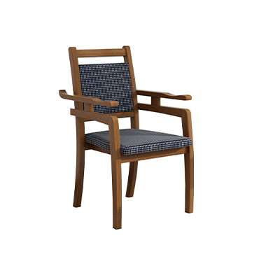
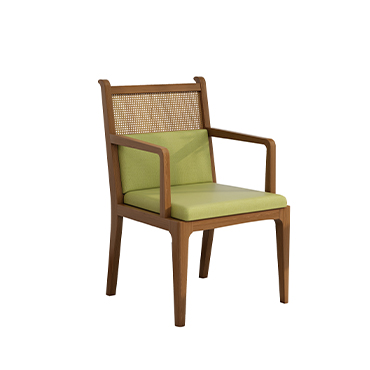
Green and brown: bring the warmth of forests and earth.
Beige and soft blue: create a peaceful and familiar atmosphere.
Earth tones: pair well with warm colors for a safe, cozy space.
These tones reduce stress and make interiors feel natural and secure..jpg")
Using Color to Improve Safety
Color choices can also prevent accidents and support independence.
Use red or orange tape on steps or thresholds to make them visible.
Avoid yellow markers on wooden floors, as they may be hard to notice.
Choose beige or brown furniture, and highlight important tools or handrails with contrasting colors like red.
Lighting and Color Perception
Lighting is just as important as color in senior-friendly home design.
Avoid harsh direct light, which can cause discomfort—especially for those with cataracts.
Use indirect lighting for a soft, evenly lit environment.
Let natural sunlight in during the day to brighten the room and boost mood.
Final Thoughts
By combining safe color contrasts, natural tones, and proper lighting, you can create a living space that is not only aesthetically pleasing but also comfortable and safe for seniors. Whether you are redesigning a bedroom, living room, or care facility, the right color choices can improve both quality of life and peace of mind.